Trying gouache
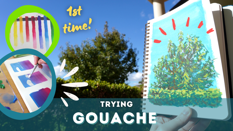
Although I bought myself some gouache a few years ago I've barely touched it in that time. A few things were holding me back: fear of a new medium, "not having the right tools" and "finding the right time". With Plein Airpril I decided it would be good to try them for plein air landscapes. But first let's explore gouache with some exercises.
Note: None of the links in this article are affiliated or sponsored.
What is gouache?
Gouache (pronounced like squash) is a water-based medium that is opaque, unlike watercolour which is mainly transparent. However gouache can be diluted to behave like watercolour and become transparent too. Ultimately the opacity is why people choose gouache instead of watercolour - it allows for corrections to be applied on top of existing paint without letting what's underneath show (whereas transparent watercolours use glazing to allow the colours underneath to show through). Gouache colours are more vibrant and dry with a matte (non-glossy) finish.
How is it different to using watercolour?
Due to the difference in opacity there is a huge mindset shift compared to using watercolours. Essentially the workflow is reversed: when painting with transparent colours each stroke adds darkness and it's difficult to maintain light colours, so lights are laid down first and then left alone as areas get darker.
In watercolour the brightest white will be the white of the paper, so its usually left blank. Working from light to dark is how watercolours maintain their vibrancy (allowing the white of the paper to shine through and brighten the painting).
On the other hand white gouache is so opaque that even black underneath it can be obscured. On top of that (ha), laying down light colours first leads to muddy colours as additional layers can reactivate those below and blend. Highlights are sharpest and cleanest when added last, so the workflow goes from dark to light.
Furthermore, gouache doesn't rely on the white of the paper or dilution to lighten colours, instead hues are lightened with white pigment and darkened with black. Otherwise colour mixing is the same and gouache can be used together with watercolour (but might not be ideal).
Both gouache and watercolours have a drying shift, where colours change hue slightly as they dry. Gouache seems to have a larger shift and I'll discuss my experience below.
Learning how it works
Swatching the colours
The first steps I prefer to take when exploring a new medium is to swatch and 'play' to get a feel for how it looks and behaves.
I swatched each of the 10 colours from my Winsor & Newton Designer's set with a Princeton Elite 1/2" Angular shader brush on a page in my Etchr sketchbook (read about my art materials). Before I started I laid down a dark line of Payne's grey watercolour (more permanent than gouache apparently) and let it dry. The swatches went over this line to show their opacity. Each swatch stroke began thickly i.e. minimal water and was then diluted towards the bottom to show the colour's transparency and granulation.
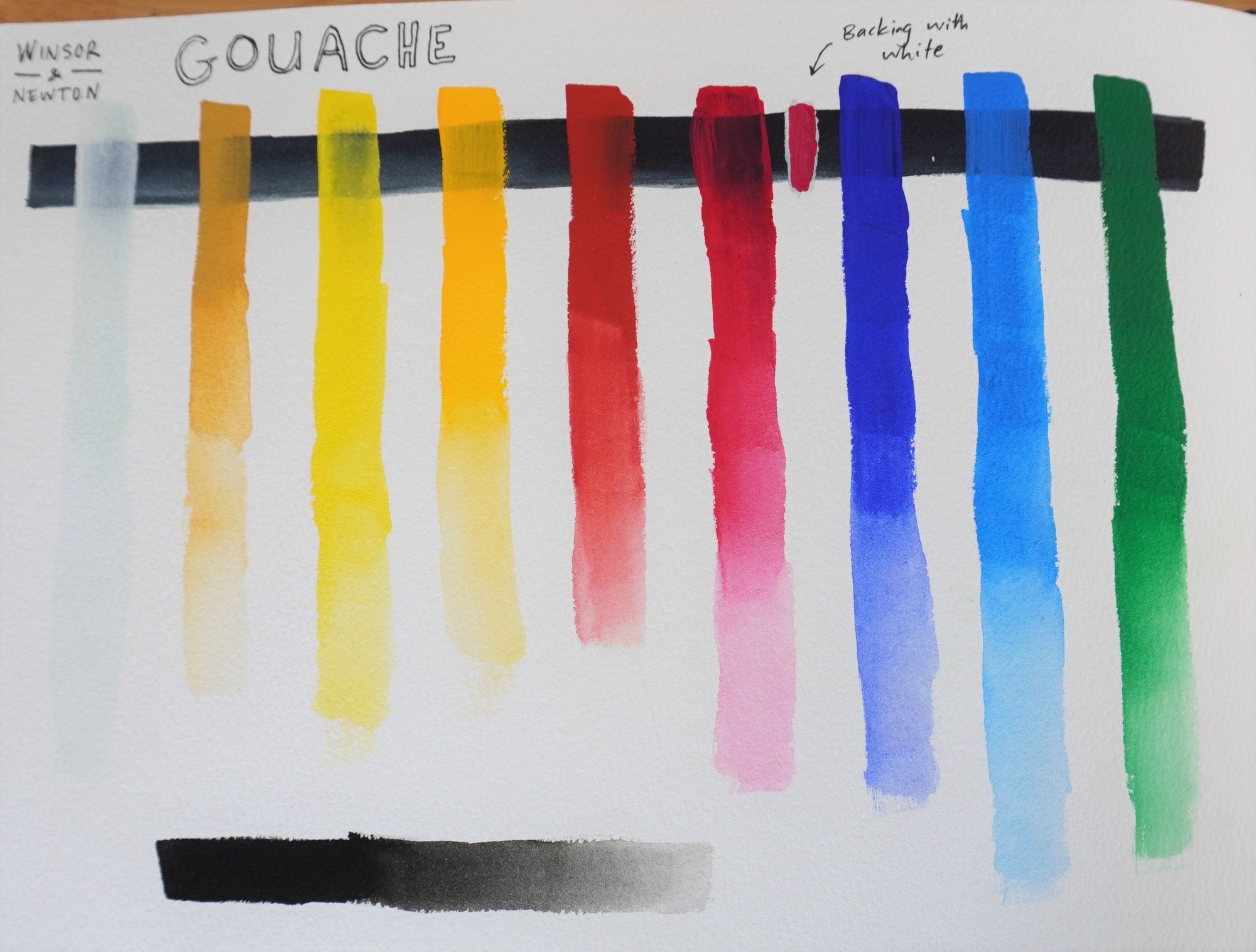
Gouache has a significant drying shift - that is the colours look quite different dry than when they're wet. In general lighter colours will dry darker while darker colours dry lighter. I think of this as the colours drying to a mid-tone and it does take getting used to, even though watercolours do have this to some extent.
I've also found that the colours do seem more vivid once dry, as if the transparency when wet hides the true colour a little bit. This has to do with the properties of the gouache and the fact that it dries on top of the paper, whereas watercolour sinks into the paper, making it more vibrant when wet.
The primary red (close to a magenta) seemed very transparent over the dark line (apparently darker colours can be less opaque) so I decided to test another technique I'd heard from Steve Mitchell (Mind of Watercolor) in his video and also from James Gurney: backing with white.
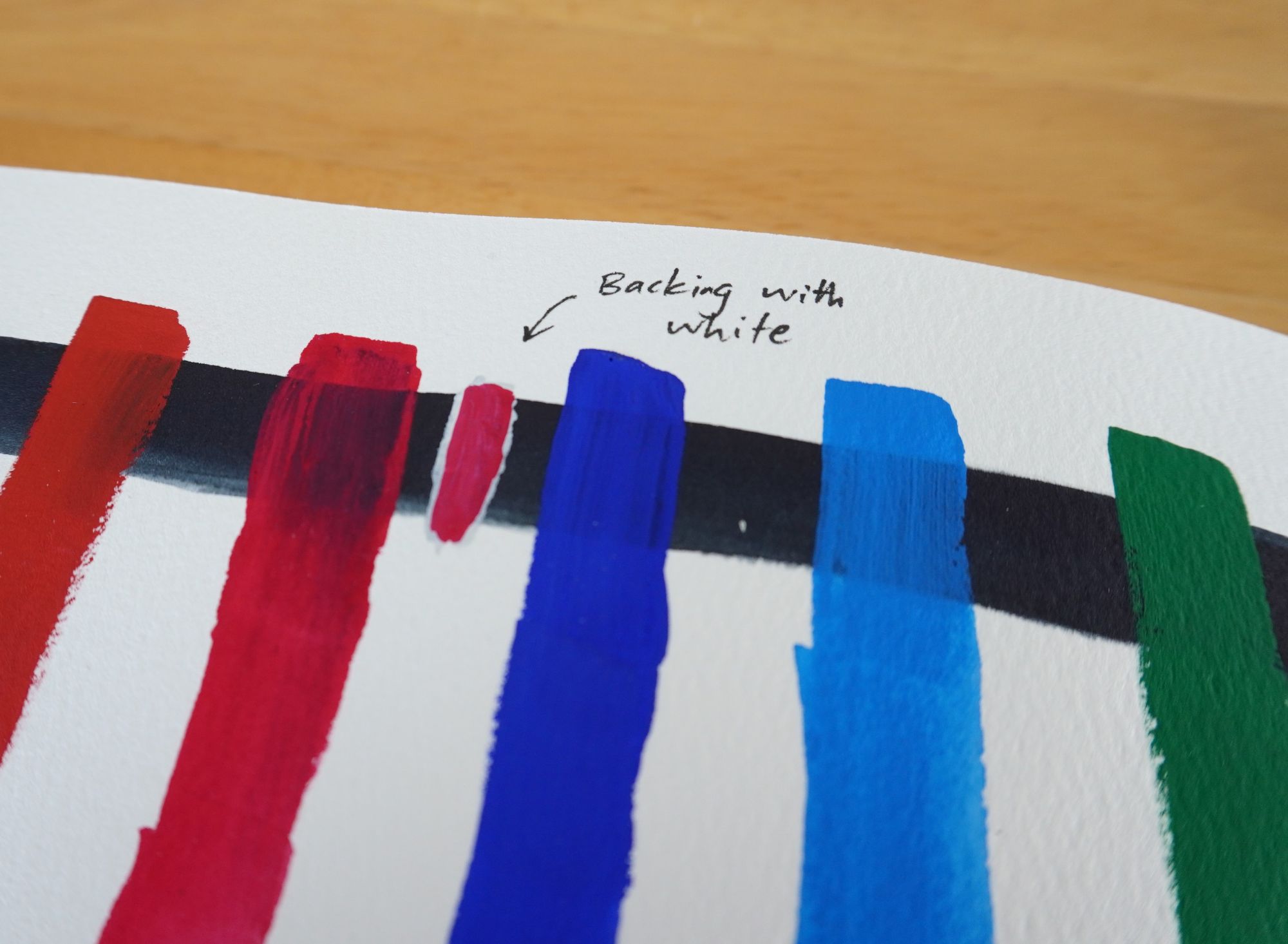
First I laid down a small amount of white on top of the dark colour and let it dry. Then I added the desired colour as a final layer. This technique allows the pigment to show its true colours (pun intended) on top of a darker colour.
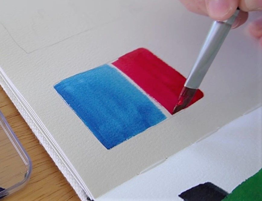
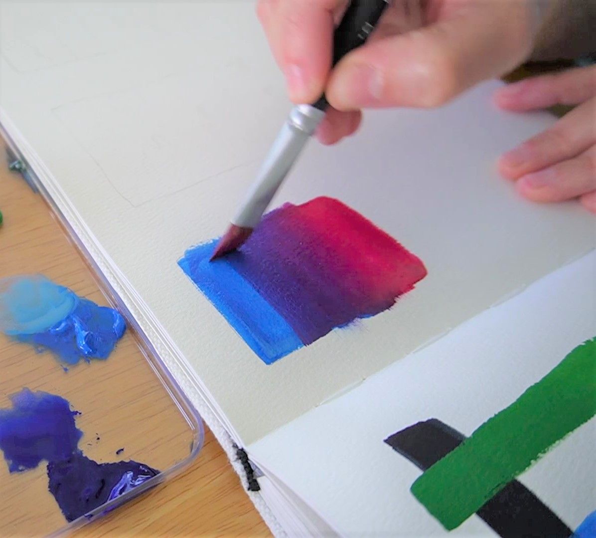
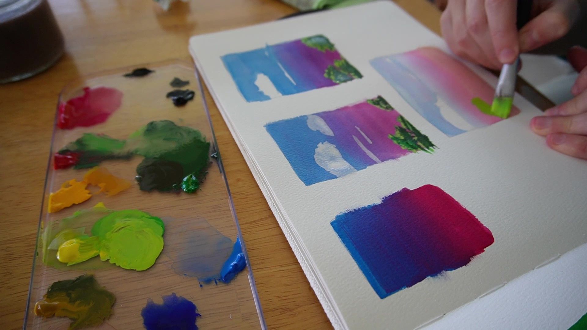
Painting a gradient and blending
My next test was to create a gradient using two colours (following a tutorial from Mary Sanche). I covered the top half of a portrait rectangle with blue and the bottom half with a red. Then with a wet brush (or sometimes with a bit of blue or red) I repeatedly brushed over the middle to blend the two colours. Having a bit of white in the colours does help them mix more easily but obviously changes their hue. The more dilute the colours or mixture the more likely it is to leave streaks when dry (i.e. use thicker paint with less water to reduce streaks).
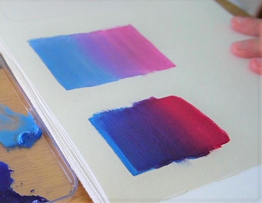
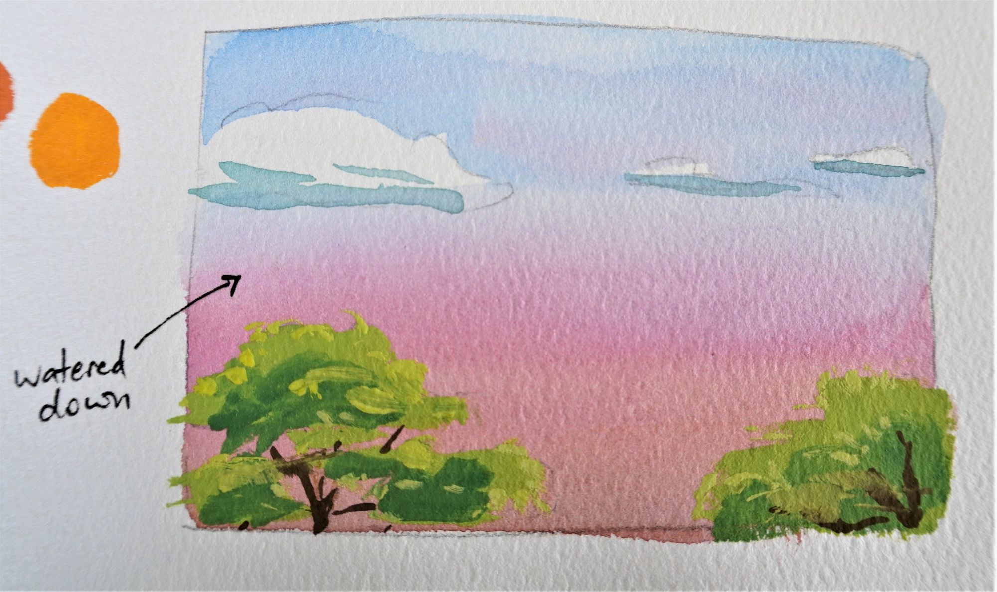
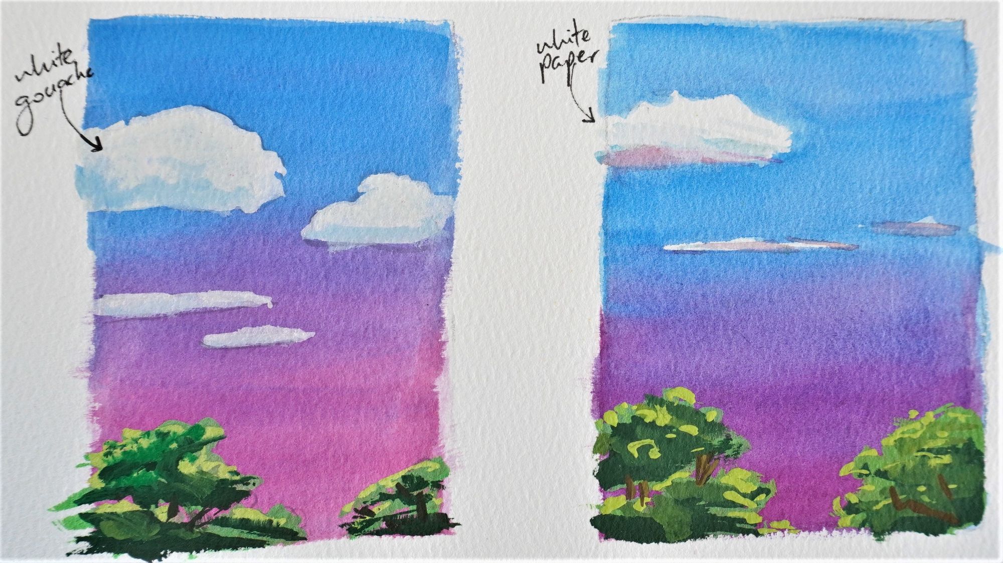
I repeated these gradients using different amounts of water to practice the blending and as background sunsets for mini landscapes. For the first landscape I left no paper white so that the clouds had to be painted on top of the blue sky, while for the second landscape I left the paper blank as I usually would with watercolour. The white gouache clouds did a very good job covering the blue sky (as long as the paint is dry underneath) but the white of the paper still seems brightest to me.
Once the backgrounds were dry I applied layers on top for the clouds and trees, aiming to work from dark to light but also getting a feel for the drying shift mentioned earlier. This meant I had to go back and add darker darks and lighter lights.
Mixing colours
I also mixed primary colours together to create the secondaries: green, orange and purple. In addition I mixed white and black with the colours to shift their hue (i.e. making tints or shades).
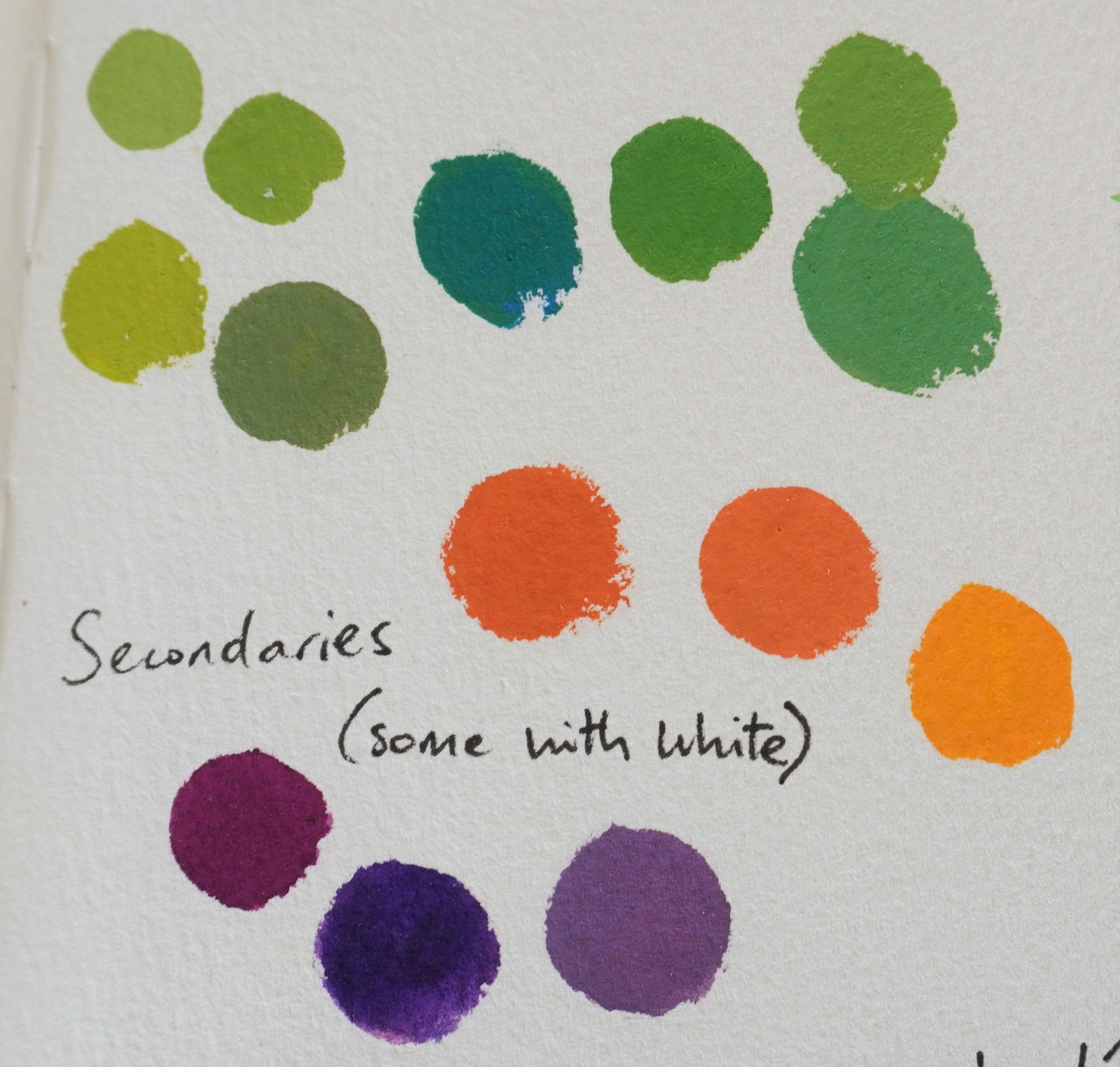
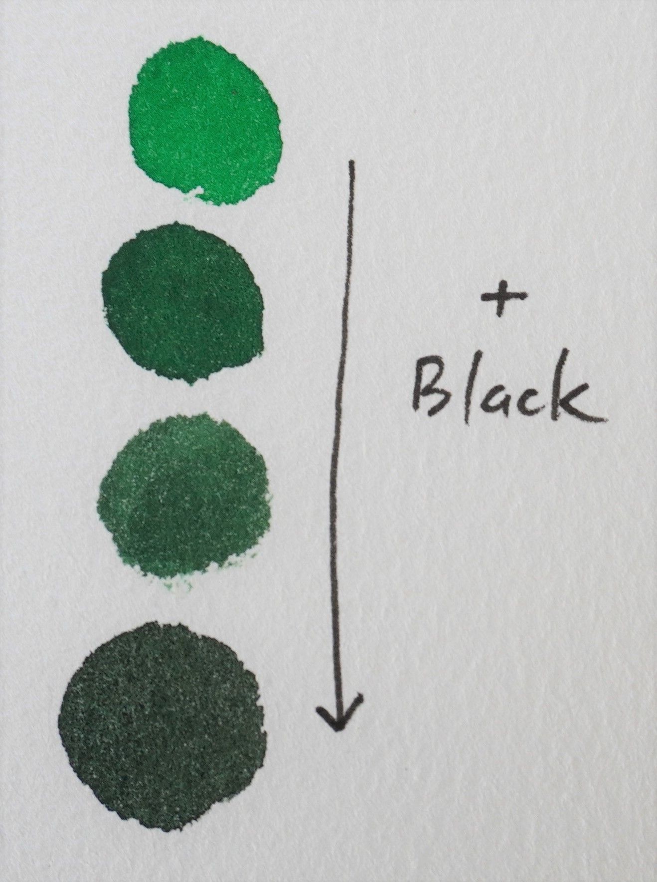
I remember that when I started painting adding white or black was my first instinct for making hues lighter or darker. This felt quite natural to me despite it not being common practice in watercolour, where the amount of dilution determines how much of the white paper shines through and therefore the tint of the colour.
Great gouache artists
If you're looking to start using gouache then here are some artists whose artistic ability in gouache inspire me and also have great tutorials:
Plein air
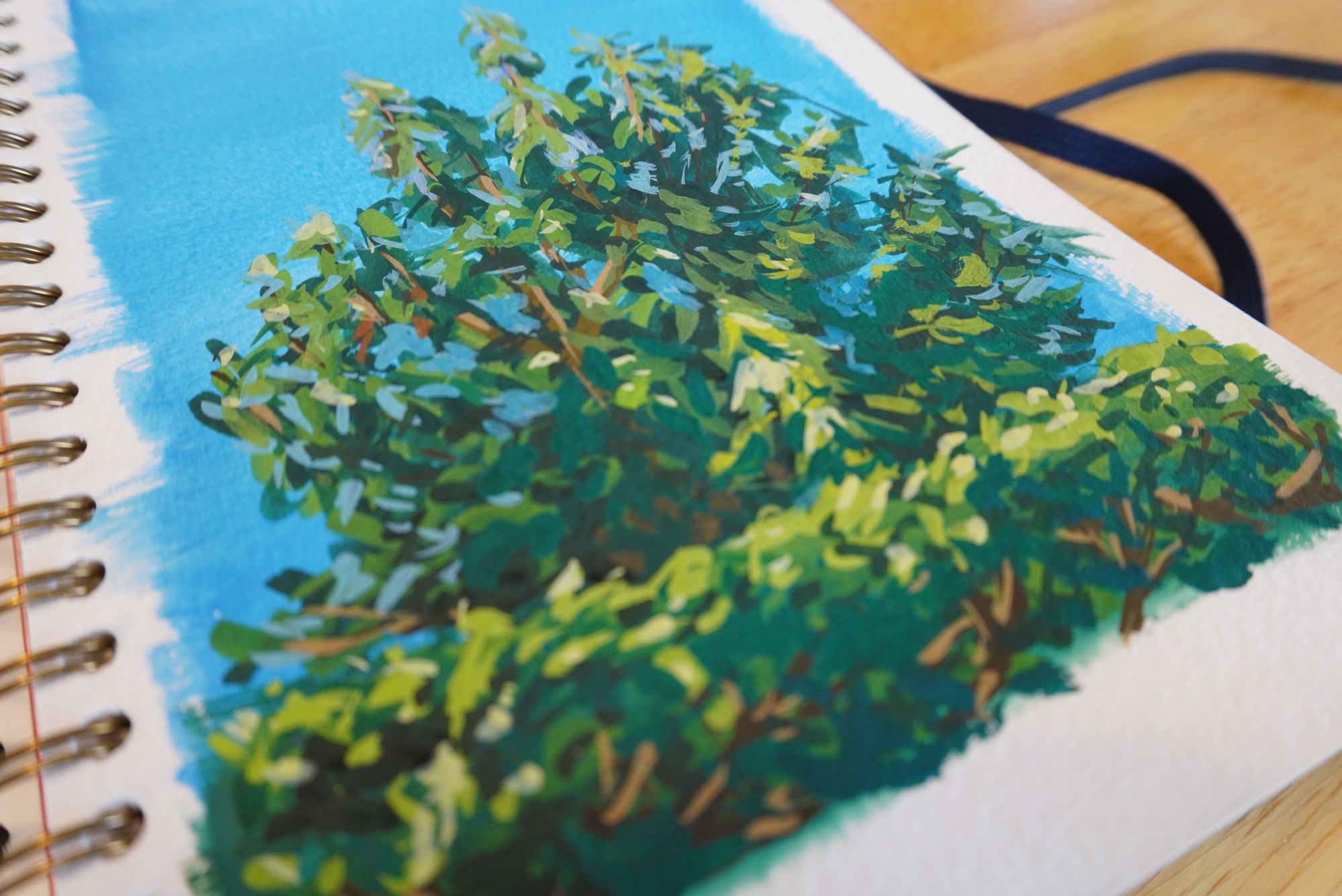
Finally I felt brave enough to have a go at doing a plein air painting with gouache. My subject was the ornamental pear tree in the front yard, with the top of the hedge framing the bottom of the page. I began with a watery blue with some white added in for the sky, this time using my Mossery mixed media sketchbook. I don't think the paper can handle too much water because it started pilling. However when I added the rest of the layers of thicker gouache it was fine. In future I will keep the paintings less watery in this sketchbook.
I took my time building up the foliage to create the illusion of depth, while working from dark to light. Once again I had to adjust and add more highlights and darks. With the numerous small marks and minimal water it dried quickly as I painted (good on paper, not on the palette). It was nice to be able to add some blue back into the sky amongst the tree, for parts I'd covered up (not usually possible for watercolour). I was also pleasantly surprised when the colours dried more vibrantly than when they were wet, not something I'd expected.
Takeaways
Overall I think I still have much to learn with using gouache but its a medium I could get used to. The drying shift was an aspect I needed to keep an eye on but it didn't bother me, I just need to become familiar with my paints. I'd like to practice using it more like watercolour for backgrounds and especially landscapes (but perhaps not plein air until I am more comfortable around gouache). Their vibrance really lends itself to this so I will pursue this further.
Otherwise I do feel confident using gouache to add details and highlights on top of a watercolour painting and also mixing it with white or black to lighten or darken the hues. The mental shift of working dark to light wasn't too strenuous, but isn't natural for me yet.
I don't like how quickly it dries on the palette but I'm aware there are methods to keep the paint wet longer so I'll need to investigate this for next time. Maybe this palette will help. Certainly watercolour seems more portable and simple than gouache in this regard. I also felt that gouache was more wasteful in that I need to use more paint (could be due to inexperience) and if left dry for too long it might no longer be able to be reactivated for a future session.
My preference seems to be to use it for adding light details on top of watercolour, rather than creating a whole painting only with gouache. I would like to try gouache on toned paper as well - I've used the white once and love the effect!
Let me know your experiences and thoughts on using gouache - have you got any tips or preferred ways of working with it?

Member discussion