Art Spectrum watercolours setup
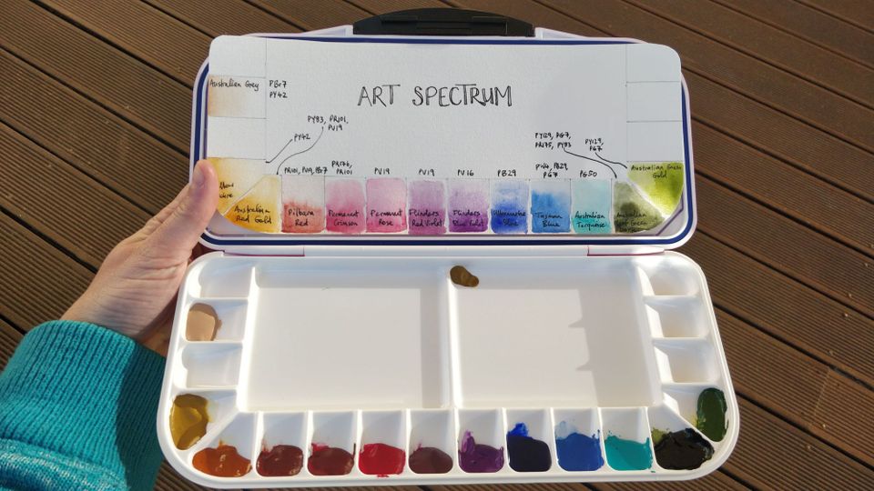
When I left my lecturing position at the start of the year my students kindly gave me some gift vouchers for an online art shop. I used them to buy some art supplies, including:
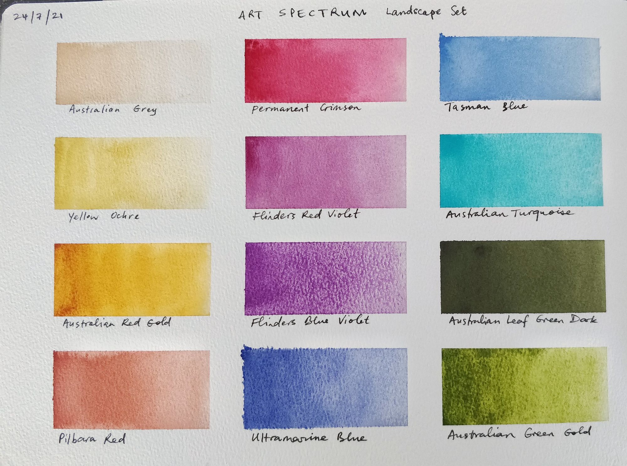
- Art Spectrum 10 mL watercolours from the landscape set: Australian grey, yellow ochre, Australian red gold, Pilbara red, permanent crimson, Flinders red violet, Flinders blue violet, ultramarine blue, Tasman blue, Australian turquoise, Australian leaf green dark and Australian green gold
- In addition the Art Spectrum 10 mL permanent rose watercolour tube (a magenta for cleaner mixing)
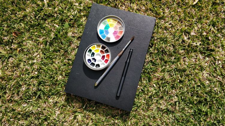
- Mijello Fusion Leakproof Watercolour Palette (in pink) with 18 wells
In the video below I set up the palette with the watercolours, swatch them out and discuss how each colour could be used to depict the Australian landscapes.
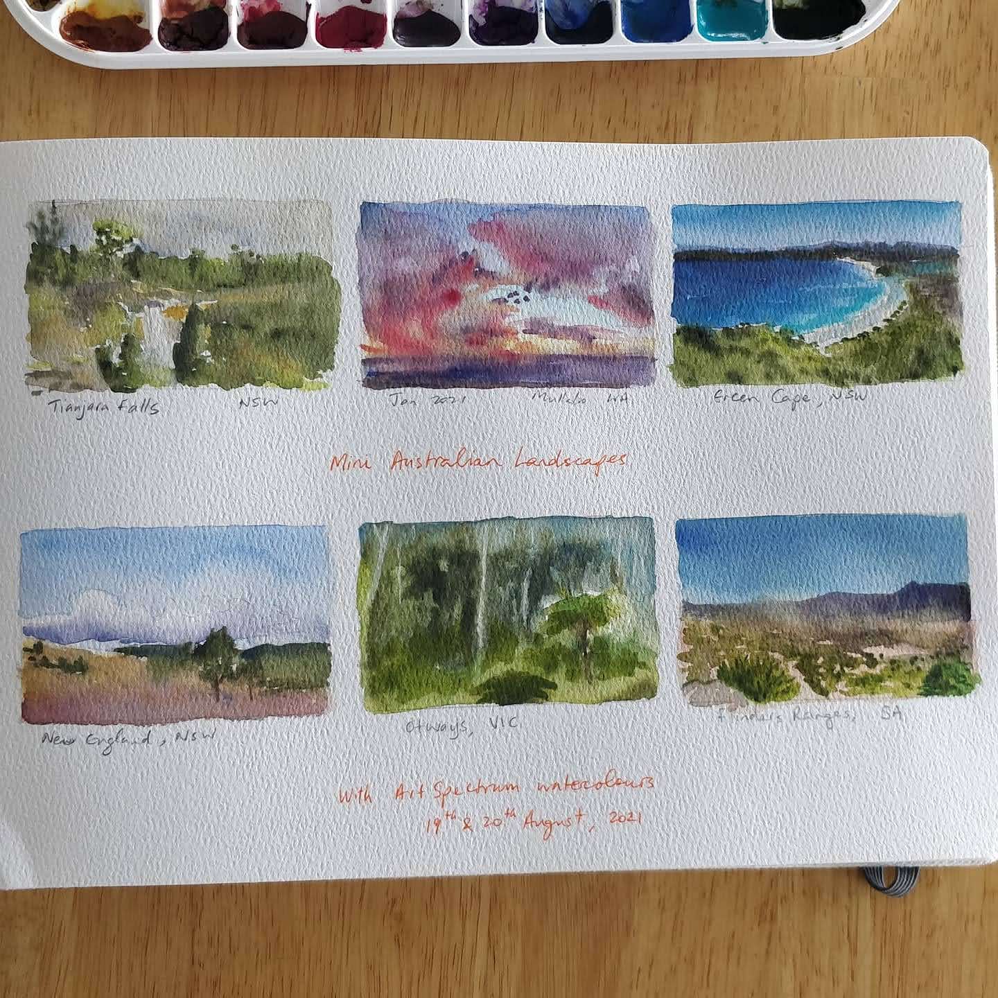
To test the watercolours I wanted to paint some mini landscapes exploring the different colours. So I selected the following six Australian landscape photos from my collection, mostly taken during my recent trip across Australia (from Sydney to Perth) as reference photos.
I painted these mini landscapes in my A4 coldpress Etchr Sketchbook:
You can watch the video of me painting these here:
First impressions
-
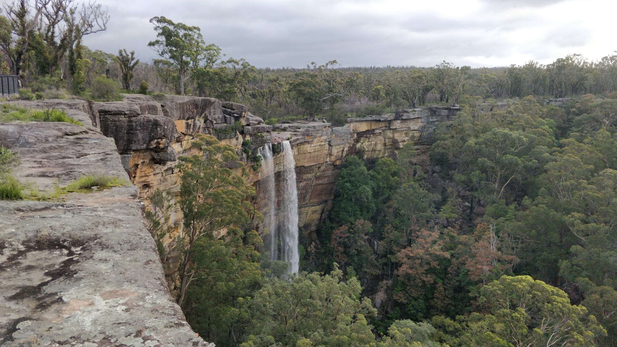
Tianjara Falls, NSW
The sky is overcast so I wanted to test how Australian Grey would go with it. I think it worked, just, only because I added some blue. I tried to use it again later but it was too orange-y and caused me a lot of frustration. This is probably not a colour I'll be using a lot and I wish I had a cooler grey to work with. I think I'll have to mix my own. The greens here worked nicely but the rocks could be more grey. -
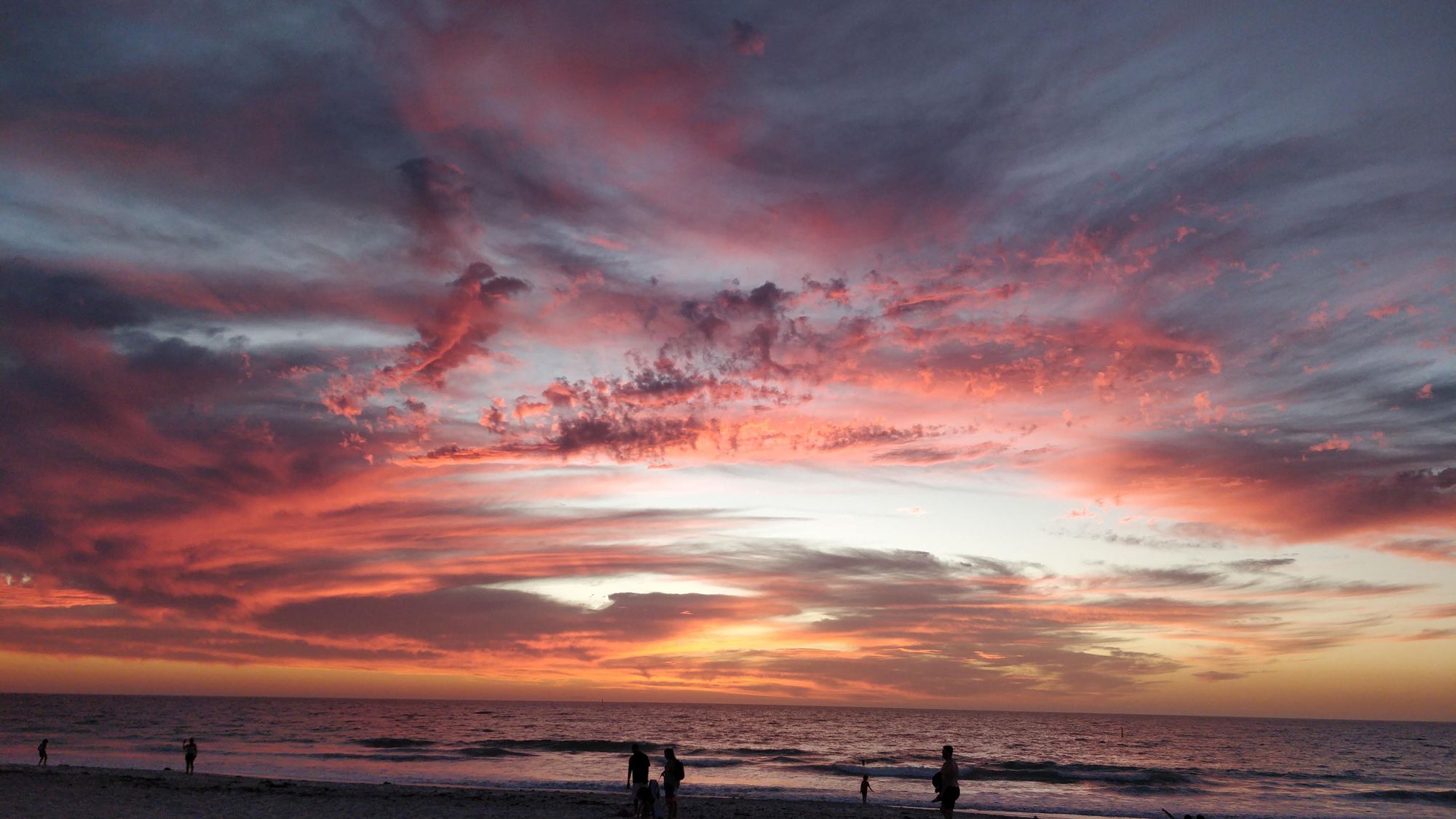
Mullaloo sunset, WA
This sunset had vivid pinks and oranges that I feel were mostly captured and the Flinders violets did a good job here. I was rushing a bit to get the most of the dying sunlight while painting so I didn't really let the paint dry enough before adding more, causing the colours to muddy. -
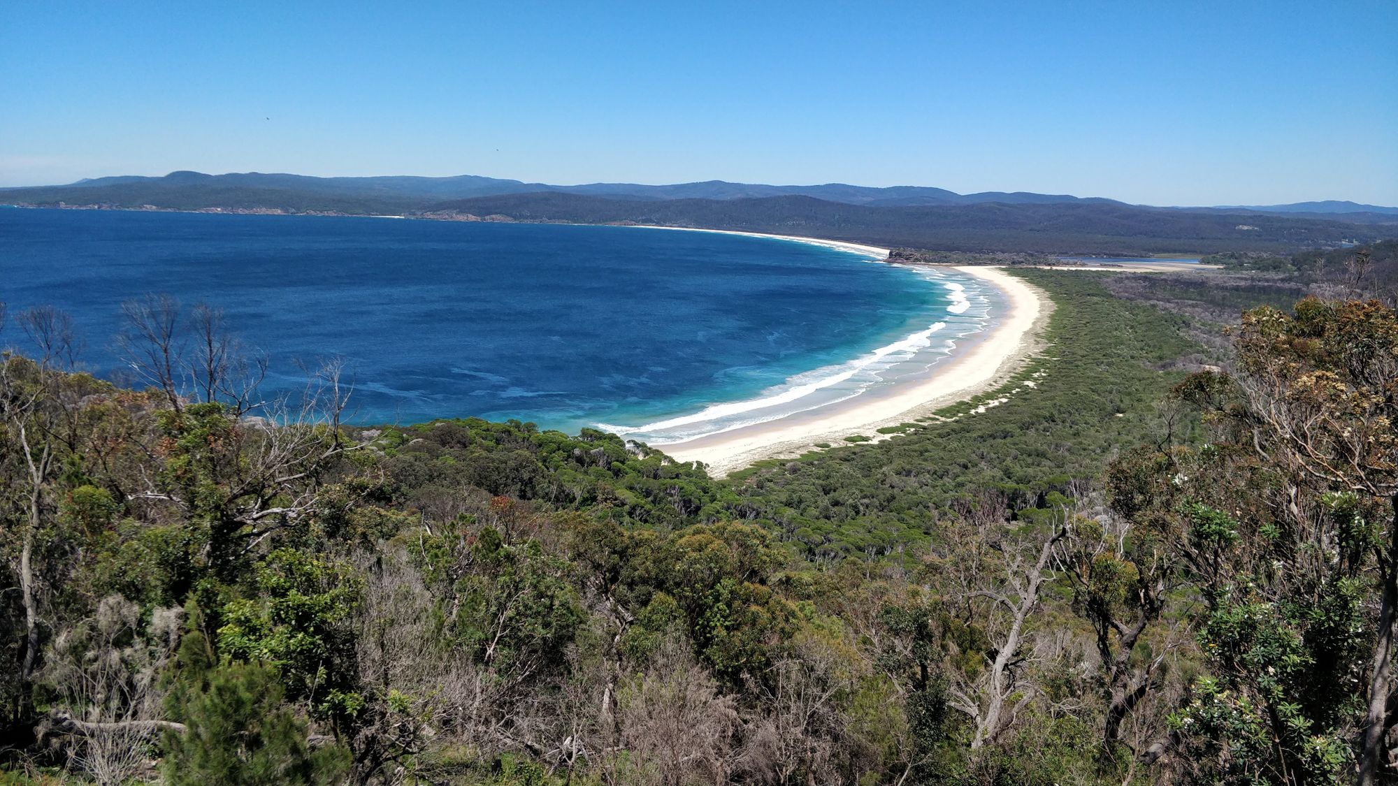
Green cape, NSW
This is my favourite, possibly because it has a beach but also since the colours came out the best. The sky is still somewhat elusive, I feel the ultramarine is not quite the right shade and needs to be mixed to be made just right but otherwise the yellow ochre in sand and turquoise waters worked really well. -
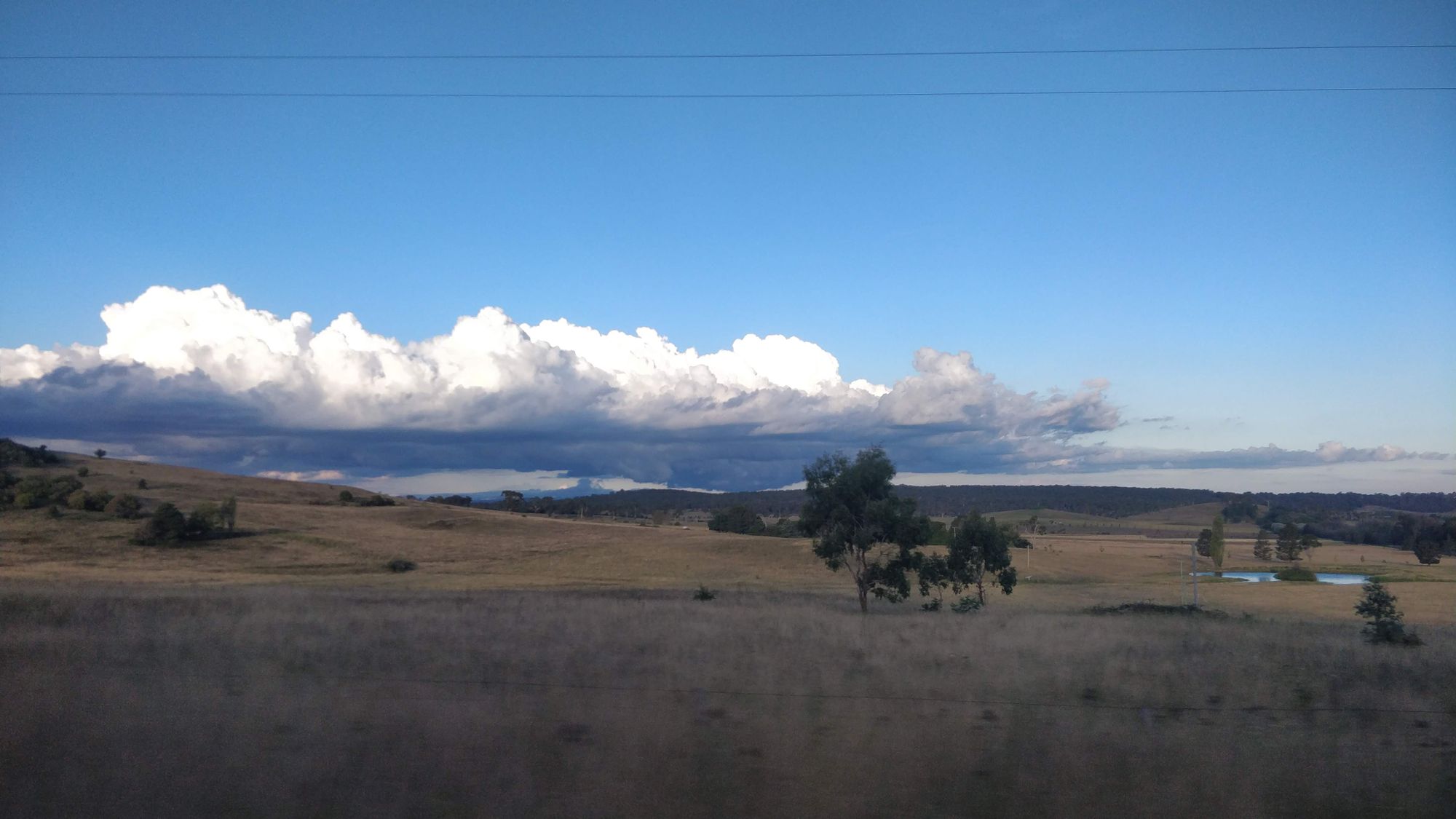
New England, NSW
This photo was taken in the car as the sun was setting and a large cloud was quickly approaching on the horizon. There wasn't a sunset yet but the grass had a purple tinge to it that I wanted to capture that time of evening. The blue sky was also not vibrant and the Tasman blue helped achieve that here. -
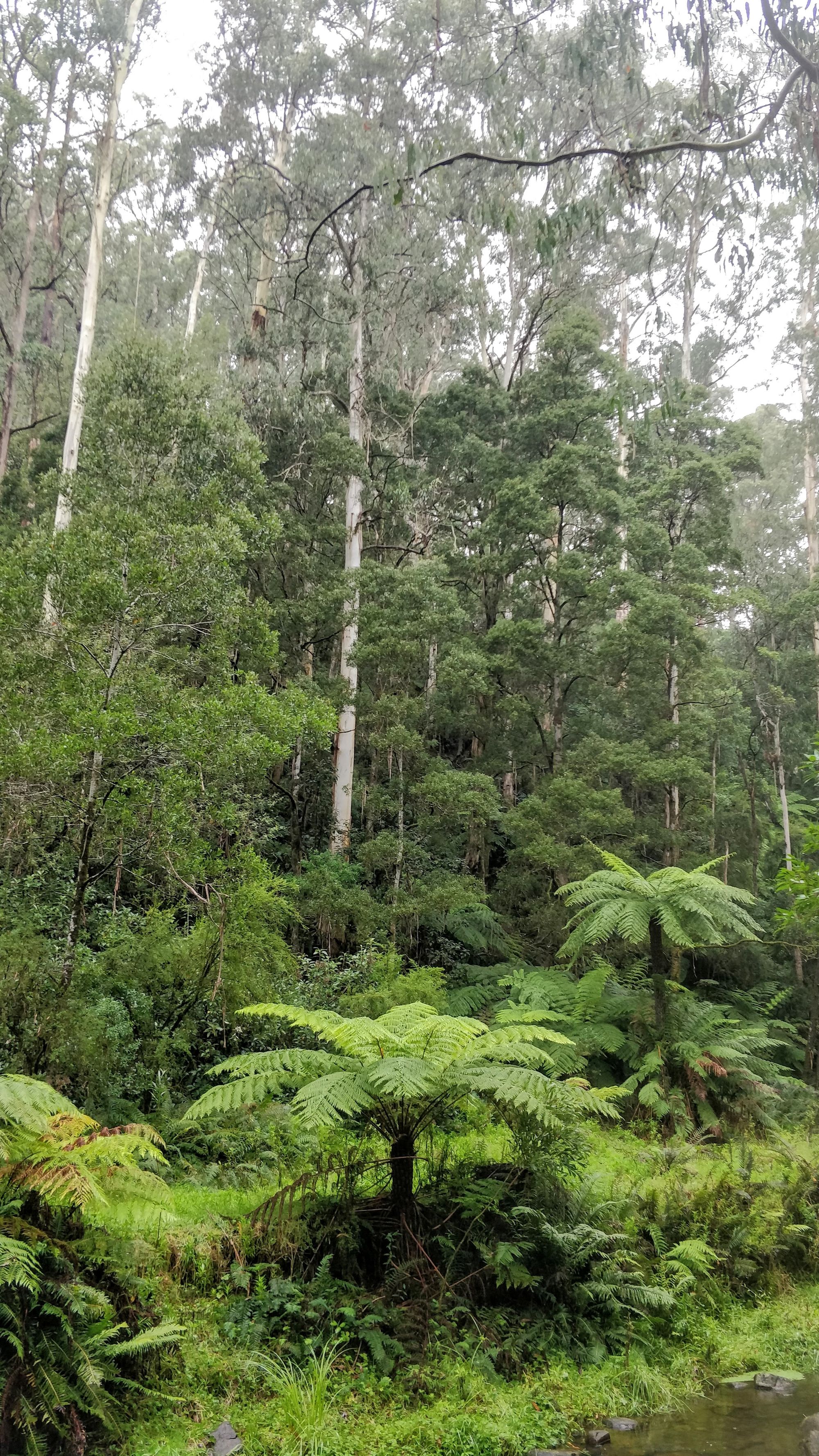
The Otways, VIC
When we camped here it was constantly wet, either rain, drizzle or humidity. It was like a cold rainforest and I wanted to capture the deep greens and grey mist. I wasn't successful at the mist (I'm looking at you Australian grey) but the greens here with a touch of turquoise or blue do turn out well. Again I was impatient so lost detail as the paint blurred because it wasn't dry. -
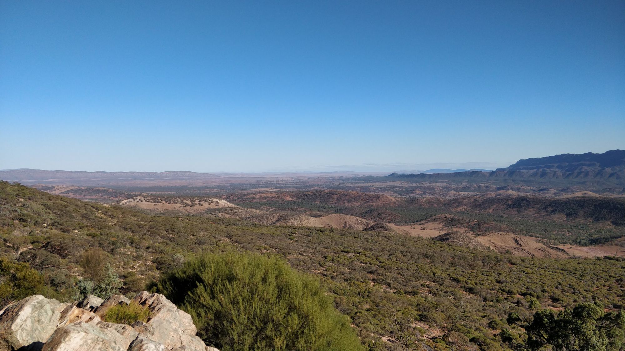
Flinders Ranges, SA
Although this didn't quite come out with all the features from the photo I think it still shows the feel for the place being very open and dry, with sand but still some bushes and the ranges in the distance.
Colours I'd have liked to test more:
Pilbara red and Flinders blue violet weren't used much in these examples but I think they would do well straight, without mixing.
Next
I'd like to create a mixing chart to see what colour combinations are possible. Since these are in quite a large palette I probably won't take this out on adventures but might do some plein air painting, perhaps a series of skyscapes over a day or a week. What do you think?
These supplies were not sponsored in any way and all opinions expressed are my own.
Member discussion